Comparison Matrix Pro for HubSpot CMS
Product & Feature Comparison Tables with Billing Toggle, Collapsible Categories & Tooltips
A premium HubSpot comparison table module that displays plans, products, or services side by side in a structured grid with categorized feature rows, check/cross/partial icons, text values, tooltips, featured column highlights, and a billing toggle. Up to 6 products, 10 categories, 30 features per category, and 80+ style controls.
Get the Module Works with any HubSpot CMS theme · Pure vanilla JavaScript · $9.99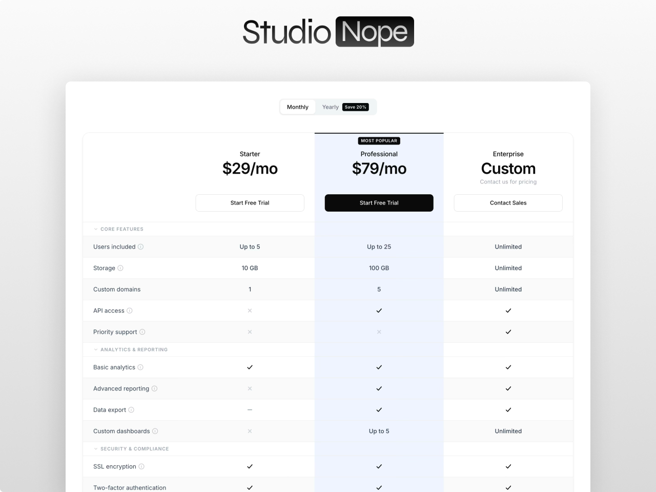
Everything you need in a comparison table
Side by Side Comparison Grid
Display 2 to 6 products in a CSS Grid layout with categorized feature rows. Five value types per product per feature: check, cross, partial, text, or empty. Split header and body architecture for horizontal scroll on mobile while headers stay visible.
Billing Toggle with Discount Badge
Animated switch between two pricing sets with customizable labels. Optional discount badge with configurable text. Smooth transition between price states. Toggle tabs with active and inactive styling and ARIA attributes for accessibility.
Featured Column Highlight
Mark any product as featured and the entire column gets a distinct background highlight with optional top border accent. Featured badge with absolute positioning that sits in the header padding space. The highlight extends through every row: header, categories, features, and CTA.
Collapsible Categories
Category rows act as accordion headers. Click to collapse or expand all feature rows within that category. Animated chevron indicator. Optional smooth max-height and opacity animation controlled by a settings toggle. Categories can start collapsed.
Tooltips on Every Feature
Optional tooltip per feature row for additional context. Keyboard accessible with tabindex and aria-label attributes. Custom tooltip background and text colors configurable from the Style tab. Tooltips appear on hover and focus.
Dual Font Pickers
Separate Primary font (title, product names, prices) and Secondary font (feature names, values, buttons, labels, tooltips, badges, categories). Full Google Fonts picker with auto-loading. Or check one box to inherit fonts from your page or theme.
8 Layout and Behavior Toggles
Compact or comfortable layout, sticky header, sticky first column, striped rows, show or hide CTA row, hover highlight, animate collapse, and scroll animation. Each toggle is independent so you build exactly the table your page needs.
80+ Style Controls
Full visual control across 13 groups: fonts, section background, container width, heading, table, product headers, featured column, badges, category headers, feature rows, buttons (primary, secondary, ghost), toggle switch, and responsive breakpoints. Nothing is hardcoded.
What you can build
Comparison Matrix Pro works for any side-by-side comparison. Here are four ways teams use it.
SaaS plan comparison
Side by side comparison of 3 to 6 pricing tiers with check, cross, and text values per feature. Billing toggle switches between monthly and annual pricing with discount badge. Featured column highlights your recommended plan.
Product feature comparison
Collapsible categories organize features into logical groups. Tooltips explain complex features without cluttering the table. Sticky header keeps product names visible while scrolling through long feature lists.
Vendor or competitor comparison
Compare your product against competitors with honest feature mapping. Text values show specific limits like storage amounts or user counts. Mobile horizontal scroll with sticky first column keeps feature names visible.
Service tier comparison
Compare service packages with descriptions, pricing, and CTA buttons per tier. Dual font pickers let you match your brand typography. Striped rows and hover highlight improve readability on dense tables.
Works with any HubSpot theme
Comparison Matrix Pro is a standalone module. Install it in any HubSpot CMS portal and drop it on any page. No theme dependency, no jQuery, no external libraries. Pure vanilla JavaScript with zero hardcoded values. Multiple instances on the same page are fully isolated via scoped CSS.
Questions
How many products and features can I compare?
addWhat value types can features have?
addHow does the mobile layout work?
addDo you offer support?
addBuild your comparison table with Comparison Matrix Pro
The most complete product and feature comparison table module on the HubSpot Marketplace. Billing toggle, collapsible categories, tooltips, featured column, and 80+ style controls.
Get the Module